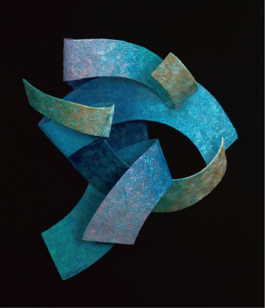
Anthony Poon’s visually abstract style shows once again in this carefully crafted aluminium sculpture. In this case, however, the work may be visually non-representational, but the title seems to suggest that Poon is attempting to portray the nature of an evening breeze in its conceptual form.
The work is composed of various intertwining ribbons. With the exception of the bottom ribbon, the lines have a largely horizontal orientation, suggesting harmony in their direction. Collectively, the rhythmic and unified arrangement of the elements calls to mind gentle movement in one direction, characteristic of wind. The occasional U-turn of some of the ribbons lends some visual interest. In a way, these anomalies decelerate the motion of the sculpture and redirect some interest back within the work. Breeze is clearly not about a determined, mono-directional gale, but is seeking to represent the calming caress of a light breeze.
Colour is applied interestingly in this work. Two departures from Poon’s modus operandi are evident.
One, the use of varied, matte-textured colours in sculpture differs from most of his single-hued and reflective sculptures. Perhaps Poon is calling attention to a very specific representation in this work and requires icy blues and gentle lavenders to put this across. This is markedly distinct from the almost total reliance on form for his other sculptural works, such as Sense Surround and Advance.
Two, the visibility of individual brush strokes is present. The colour is not applied in smooth, gradual and indistinct layers, but is applied rather haphazardly with large strokes. This is a particularly surprising departure from Poon’s deliberately academic style of painting his acrylic on canvases, in which brush strokes are virtually impossible to pick out. Once again, this unique treatment of paint could be Poon’s conscious attempt to portray the spontaneous, unpredictable nature of wind.
The choice of hues – bronze and ochre, emerald and cobalt, lavender – makes for a largely cool palette, evoking the sensation of a cold breeze blowing. This is tinted by the warmth of brown and the comfort of lavender, moderating the iciness of the primary blue hue. The overall effect is one of pleasantness to the eye and the evocation of comfort.The calmness that wind brings is well represented in Poon’s work. In this apparent defection from his usual working style, the absence of non-visual representation is fully accounted for by what I would term fairly accurate and human conceptual representation.